Inside the two-year project to unify the UC Berkeley and Cal brands
After more than 10 years, the campus is updating its brand’s visual identity to better communicate the connection between Berkeley and Cal.

Courtesy of Additive Agency
May 28, 2024
Do you attend UC Berkeley or Cal? More than just a trick question, the brand identity for the world’s top public research university has long been a source of befuddlement for many. Even a quarter of Bay Area residents apparently don’t realize the two names are synonymous.
The latest on UC Berkeley’s brand
Things have changed since the article was posted. For the latest information, visit the UC Berkeley brand site.
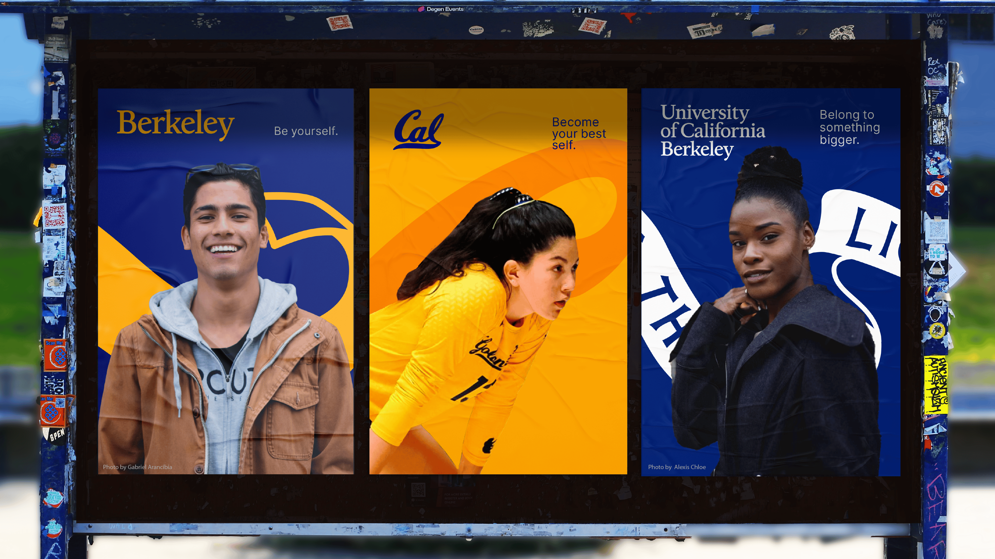
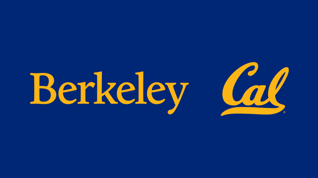
The campus last week began unveiling steps to alleviate some of the confusion. Efforts include adopting a new visual identity toolkit for both its academics and athletics, with common elements like a shared color palette and typography. The official “Berkeley Blue” color has been brightened to better match the saturation of “California Gold.” The Berkeley logo has been updated to be more legible and more closely match the styling of the Cal logo. The campus seal will be featured more prominently. And a new social media icon has been rolled out for the campus, with a “B” that matches the letter in the main Berkeley logo.
These changes will allow us to better communicate the breadth of Berkeley’s excellence.
Patrick Holmes
“These changes will allow us to better communicate the breadth of Berkeley’s excellence,” said Patrick Holmes, Berkeley’s executive director of communications and marketing. “We want people to know that the university with 26 Nobel Prize winners is the same university that has claimed 103 team national championships.”
Berkeley News spoke with Holmes about the rationale behind the refresh, the saga of confusion between the Cal vs. Berkeley debate and what’s next for the rollout.
Berkeley News: This has been a two-year process. Help us understand the scope of work you and your team did that led to these changes.
Patrick Holmes: This all started with an effort I led to reexamine our dual identities as Berkeley and Cal. I co-chaired a task force with Vice Provost for Undergraduate Education Oliver O’Reilly, and we were charged with developing a name framework for the campus. We conducted extensive qualitative and quantitative research and consulted brand experts to ensure our decision-making was informed by data and best practices.
The task force recommended that we adopt a unified campus brand strategy and other changes that required us to update our visual identity. With those recommendations in hand, we began a visual identity exploration to find ways to better align the two brands. This second phase of the work was guided by the Brand Advisory Committee, a standing group that provides input on any changes to our brand guidelines.
Many first noticed changes last week on LinkedIn or X. So what’s the deal with the “B” logo on UC Berkeley social media accounts?
Well, first of all, the “B” is not a logo. It’s just a social media icon. In fact, when the new guidelines are released, they will specify that the “B monogram,” as we’re calling it, “is only to be used in small spaces where the Berkeley logo would be hard to read.”
It’s common for brands — including for other prestigious universities like Yale and Dartmouth — to use a letter from their name as their social media icon. Because the B monogram is simply the B from the Berkeley logo, it creates a clear visual connection between the two.

Courtesy of Additive Agency
This is about a lot more than social media though, right?
Most definitely. In fact, the new social media icon is probably the least interesting part of this whole effort. The Berkeley logo has been rerendered by a widely respected typographer named MCKL. They’ve worked with some of the biggest brands you can think of and really did an amazing job.
The Berkeley logo is based on a custom typeface called University of California Old Style, which was created by Frederic Goudy for the University of California Press in the 1930s. The typeface has evolved over time as we moved from print to digital, and ironically, it became less legible in digital spaces. MCKL took a look at the original metal version of the typeface, as well as other Goudy works, to evolve the logo to complement the Cal Script and work across digital and print contexts.
For some, brand cohesion might seem very niche. Why did you want to take on this project? Where did the spark come from?
Growing up in nearby Oregon, I felt like I had a good sense of the California universities, and my brothers were always watching a lot of college sports. I don’t know how old I was, but I distinctly remember the day my brothers were watching a football game between Cal and UCLA. I was like, “Which one is Cal?” When they explained that Cal was the same university as UC Berkeley, I remember thinking I was too old to have not known such a basic fact. And since working here, I’ve had that exact same scenario play out, I’ve had to explain to numerous people I’ve met that we’re the same institution. So many people don’t know we’re the same university. That was the impetus for this work.
We want people to know that the university with 26 Nobel Prize winners is the same university that has claimed 103 team national championships.
Patrick Holmes
Some people say, “Who cares? Why does it matter?” For a lot of people, the associations they have with Berkeley are not of a large research university. They think it’s a much smaller university, or perhaps a large liberal arts college. The primary reason for that is because all of the things you associate with a large university — especially sports and school spirit — are all associated with the Cal name. The two get completely lost, and I think that really damages the reputation of the university.
All of this is about bolstering the reputation of the university and increasing the value of people’s diplomas.

Courtesy of Additive Agency
But if Berkeley continues to be shorthand for academics, and Cal for athletics, does this brand refresh really solve the problem?
This certainly helps. Aligning our visual assets — aligning the colors, the graphics, the typography, the other elements of the brand — allows people to make visual connections between the two.
Oftentimes, those visual connections aren’t really a conscious thought. If you’re driving down the freeway and you see a billboard for Cal Athletics and it has the same look and feel as a Berkeley brochure from a college fair, there’s a better chance you’re going to make the connection between the two, whether you realize it or not. It’s certainly going to help people make those connections. There’s still more work to do, and we will need to continue to find ways to help people clarify the two.
Part of what this does is open the door to help find those opportunities. And when they’re put together, the Berkeley and Cal logos work much better together and appear as if they’re part of the same system. It makes it easier to form associations between the two and to actually think these two are part of a larger whole.
When will the complete rollout be done?
We’re still putting the finishing touches on the visual identity. Namely, we’re still finalizing how school, college and department names will look with the new logo. We hope to finish that work by mid-summer, and then you’ll start to see the new visual identity in use in more places.
That said, we expect a gradual rollout, as it will take time for people to update their websites and cycle through any printed material they have already produced. The beauty of these changes is that it won’t be terribly confusing for the two logos to coexist in the world. It’s clear that the new logo is an evolution of the old, so we’ll be able to build upon the existing brand equity and take it to the next level.